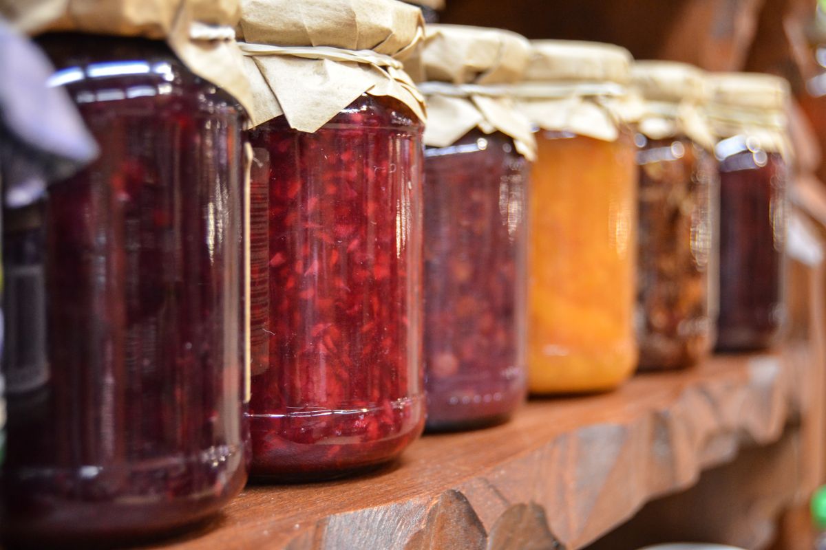
In 2000, two psychologists set up a tasting booth in an upscale grocery store. On some days the table held 24 kinds of jam. On other days it held 6. The big display pulled a bigger crowd, no surprise. But here is the part that made the study famous: at the table with 24 jams, about 3 percent of people who stopped actually bought a jar. At the table with 6, about 30 percent did. Cutting the options from 24 down to 6 made people roughly ten times more likely to buy.
That study, run by Sheena Iyengar and Mark Lepper and published in the Journal of Personality and Social Psychology, kicked off decades of work on what researchers call choice overload. The short version: when people face too many options at once, with no easy way to compare them, they often do the one thing you least want. Nothing. They stall, they put it off, they leave.
Now open your practice website on your phone and look at it the way a nervous first time patient would. Odds are you built yourself a 24 jam table.
Why this hits healthcare harder than almost anywhere else
Choice overload gets worse under three conditions, and a person looking for care checks all three boxes.
First, the options are hard to compare. A patient usually cannot tell from the outside whether they need the deep cleaning or the standard one, the consult or the full evaluation. Second, the stakes feel high. This is their body and their money, not a jar of jam, so the fear of choosing wrong is real. Third, they often have no guide. They are alone on their couch at night with a phone, and your website is the only thing standing in for a helpful front desk.
Put those together and even a motivated patient can freeze. They came ready to book. They left to think about it. Most of the ones who leave to think about it never come back.
Where practices accidentally build the 24 jam table
Nobody sets out to overwhelm patients. It happens one well meaning addition at a time. Here is where we see it most.
The homepage that lists every service you have ever offered
A med spa we looked at had 22 treatments listed on the homepage, each with the same size icon and the same tiny button. Botox sat next to a service they do twice a year. The owner was proud of the range. To a new visitor it read as noise, and the one thing most people came to book was buried in the middle of the pile. A med spa website that leads with its top three or four treatments will out book one that shows all 22 as equals, every time.
The four contact options with equal weight
Call us. Book online. Request a callback. Text us. Fill out this form. Chat with us. When all six sit on the page shouting at the same volume, you have handed the visitor a decision you should have made for them. Which one is fastest? Which one actually gets me an appointment? They do not know, so they pick the easiest option of all, which is to close the tab. For most practices there should be one loud primary action and everything else should stay smaller. This is the whole idea behind writing a single call to action that books patients instead of a menu of them.
The navigation menu with 14 top level links
Every page you add to the menu is another jam on the shelf. There is a rule of thumb in web design called Hick's Law: the time it takes someone to make a decision grows with the number and complexity of the choices in front of them. The Interaction Design Foundation describes it plainly, and it applies to your nav bar as much as your service list. A tight menu of five or six clear items helps people find what they need. A sprawling one just makes them think harder before they have even started.
The intake form that asks for everything up front
A booking form with 18 fields is a choice overload problem wearing a different hat. Every extra field is another small decision and another reason to quit halfway. Ask for the few things you truly need to hold the appointment, and collect the rest later, once they are already a patient.
Fewer choices does not mean a thinner practice
Here is the fear every owner has when we suggest trimming: that cutting options on the website means cutting the business, or hiding what they do. It does not. The goal is to organize and prioritize, not to amputate.
Think of it as a clear main road with side streets available. Most visitors should see one obvious path: here is what we do, here is the proof, here is the button to book. The patient who wants the full catalog of services and prices can still find it one click away. You are not removing anything. You are deciding what gets the spotlight so a ready to book patient is not slowed down by a wall of equally shouting options.
And to be honest, because we care more about what works than about a tidy story: the paradox of choice is not a law of physics. The jam study has not held up in every follow up experiment, and sometimes more options really do help, especially when people already know exactly what they want and the choices are easy to compare. But a health decision is rarely easy to compare and rarely low stakes. So for a practice website, leaning toward fewer, clearer, well guided choices is simply the safer bet. You are playing the odds, and the odds favor simple.
What a focused page actually looks like
When we rebuild a practice site, the test for every page is the same: if a stranger landed here cold, would they know the one thing to do next within three seconds? A few moves get you there.
- Pick one primary action per page. Usually book an appointment or call. Make that button the loudest thing on the screen, and repeat it as the person scrolls. Everything else stays smaller.
- Feature your top services, do not dump all of them. Lead with the three to six that most patients actually come for. Keep the complete list on a dedicated page for the people who go looking.
- Trim the menu. Five or six clear top level links beat fourteen. If the nav needs a scroll bar, it is a shelf with too many jams.
- Offer three price tiers, not ten. When you do show options, three is the sweet spot, with the middle one marked as the popular choice. People compare three easily. Ten makes them stall. This is also why thinking hard about what belongs on your homepage matters more than cramming it full.
- Shorten the form. Ask for the minimum it takes to book, then get the rest at intake.
How EtherealMinds thinks about it
Our honest opinion, after building these only for healthcare: most practice websites are not losing patients because they say too little. They are losing patients because they say everything at once and point everywhere at the same time. The owner sees a complete site. The patient sees a 24 jam table and backs away. We design the opposite. A website built to convert leads with one clear path, features what matters, and makes booking the easiest decision on the page, while still letting the curious patient dig deeper if they want.
That focus is also the backbone of our full patient acquisition system. It does not matter how many people we send to your site from ads, search, or social if the page they land on asks them to solve a puzzle. Get the one next step right, and every other channel you run suddenly converts better, because you stopped making people choose when all they wanted was to book.
Not sure if your website is a 6 jam table or a 24 jam one?
Book a free strategy call. We will pull up your site, show you exactly where patients are freezing instead of booking, and point out the two or three changes that would get more of them to act.
Book a free strategy call →