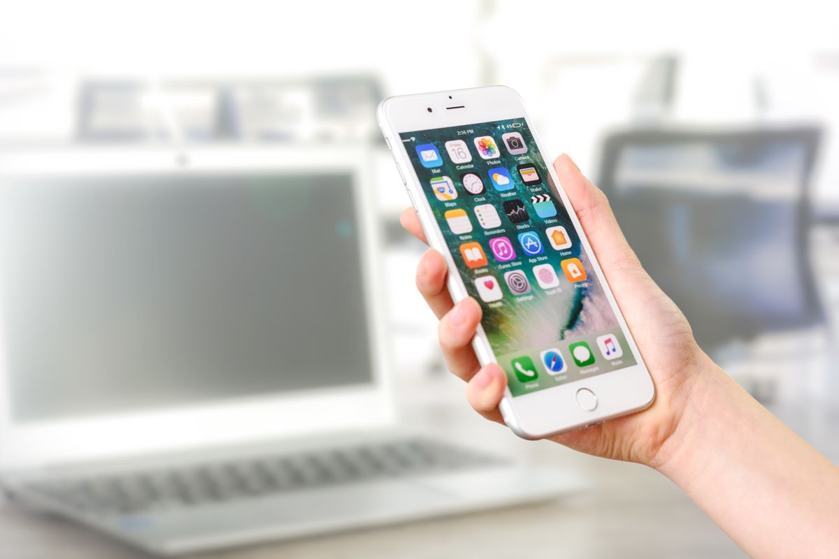
A dermatology office called us a while back, frustrated. Their website looked beautiful on the big screen in the office manager's back room. Slick photos, a tidy booking form, the works. But new patient bookings from the site were flat. So we did the simplest test there is: we opened their site on a regular phone, standing in a spotty signal area, the way a real patient would. It took nine seconds to load. The Book button sat below three full screens of scrolling. The intake form opened as a PDF that would not fit the screen. On the desktop it was lovely. On a phone, where their patients actually lived, it was a wall.
That gap is the whole story. So let us answer the question with real numbers, then get to the part that pays: what to fix.
The honest answer: patients live on their phones
More than 60 percent of all Google searches now happen on a mobile device, and health related searches skew even more mobile, because people look things up the second a symptom, a worry, or a stray thought hits them. Nobody waits to get home, sit at a desk, and boot up a laptop to search "urgent care near me" or "is this rash normal." They pull out a phone in the parking lot, on the couch, in bed at 11pm.
Two more numbers make it concrete. According to Pew Research, roughly 9 in 10 US adults own a smartphone, and about 15 percent are "smartphone only" internet users, meaning they have little or no other way online. For those patients, the phone is not the preferred screen. It is the only screen. If your site fails there, you do not exist to them.
Does desktop still matter at all? A little. There is a real pattern where people first discover you on a phone, then do slower research later on a work computer during the day, sometimes finishing a longer form there. So a small share of bookings, especially detailed intake, gets completed on desktop. But the discovery, the first impression, and most of the actual bookings happen on the phone. When you have to choose which screen to build for first, it is not a debate.
Why this is bigger than convenience: Google ranks your mobile site
Here is the part a lot of owners miss. Since Google switched fully to mobile first indexing, it ranks your website based on the mobile version, not the desktop one. Read that again. The phone version of your site is the one Google judges. So a practice with a gorgeous desktop site that turns clumsy on a phone is not just losing the mobile bookings, it is losing search ranking too, which means fewer patients ever find the site in the first place.
This is exactly why we treat mobile as the starting point, not an afterthought, in everything we cover on whether your medical practice website is mobile friendly. It is not a design preference. It is where the ranking and the revenue both live.
What breaks on a phone without anyone noticing
Most practice sites do not fail on mobile in some dramatic, obvious way. They fail in small, invisible ways that each shave off a few patients until the total is a real hole in your schedule. The usual suspects:
- It loads too slowly. Google found that as mobile page load goes from one to three seconds, the chance a visitor bounces jumps about 32 percent. Push past five seconds and you are hemorrhaging patients before they see a single word. We dug into this in how website speed affects patient bookings.
- The Book button hides. On a phone, if someone has to scroll back to the top to find how to book, a lot of them just give up. The booking action has to follow them down the page.
- No tap to call. On a phone, your number should be a button that dials when tapped, not plain text a patient has to copy, switch apps, and paste. Every extra step loses people.
- Forms built for a mouse. Fifteen fields, tiny checkboxes, and a keyboard that pops up wrong. Long forms are the number one reason people abandon a booking, which we broke down in why patients abandon your online booking form.
- PDF intake forms. A downloadable PDF that a patient is supposed to print, fill out, and scan is a desktop relic. On a phone it is a dead end.
- Tap targets too close together. Links and buttons crammed so tight that a thumb hits the wrong one. Small friction, real drop off.
None of these show up when you glance at your site on the office computer. Every one of them shows up the instant a real patient tries to book from a bus seat.
The two minute test anyone can run
Pull out your phone, turn off wifi so you are on cell data like a patient, and open your website. Time how long it takes to load. Now, without scrolling back up, try to book an appointment as fast as you can. Can you tap to call in one touch? Does the Book button follow you as you scroll? Does the form fit the screen and take under a minute? If any answer is no, that is a patient you are losing today, not someday.
Phone or online booking? Give patients both
There is a second layer to this question. Even on a phone, patients split on how they want to book. Younger patients and busy parents often prefer to book online at 10pm without talking to anyone. Older patients, and anyone with a complicated situation, would rather tap the number and talk to a human. We covered that divide in whether patients prefer to book online or call.
The right move is not to pick one. It is to put a tap to call button and an online booking option right next to each other, high on the page, and let each patient choose their own path. Forcing everyone to call annoys the self serve crowd. Forcing everyone through a form annoys the callers. Offer both.
But offering tap to call only works if someone actually answers. If half your callers hit a voicemail during lunch or after hours, you spent all that effort getting them to your site just to drop them at the finish line. That is where our AI receptionist earns its keep: it picks up every call, day or night, answers the common questions, and books the appointment so the phone patient never slips away to the next office on the list.
Our honest opinion
Too many practices spend real money driving patients to a website, then hand those patients a mobile experience built like it is still 2012. The ads work, the Google listing works, the patient taps through, and then the site fumbles the ball on a small screen. It is the most expensive kind of leak, because you already paid to create the demand.
Building for the phone first is not about chasing a trend. It is about meeting patients on the only screen many of them use, on the exact screen Google ranks you by. A fast, one thumb friendly site with an obvious way to book or call is worth more than a redesign full of animations that no one on a phone will ever wait to load. Simple, fast, and bookable beats pretty and slow every single time.
Where EtherealMinds fits
We build websites that convert mobile first on purpose, because that is where your patients are: fast loading, a booking button that never leaves the screen, tap to call, and short forms that finish in under a minute on a phone. That site then plugs into a full patient acquisition system, so the traffic from ads, social and search actually turns into booked appointments instead of bouncing. And because Google ranks the mobile version of your site, our healthcare SEO work treats mobile speed and structure as the foundation, not a checkbox. The phone is where patients decide. We make sure your practice wins on that screen.
So, do patients book on their phone or their computer? The phone, overwhelmingly, with a slice of desktop research along the way. Build for the thumb, load fast, make booking and calling both one tap away, and make sure a real answer waits on the other end. Do that and the patients who were already looking at you on their phone actually make it into your schedule.
Find out what your site does on a real phone
Book a free strategy call. We will open your website on mobile with you, time it, try to book like a patient, and show you exactly where you are losing bookings on the small screen. No jargon, no filler, no pressure.
Book a free strategy call →