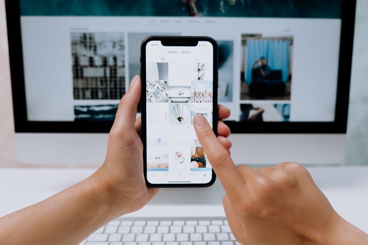
A med spa owner showed us her analytics a while back and could not make sense of them. People were landing on her site, staying a good while, reading two or three pages, and then just leaving. Her traffic was healthy. Her bounce rate was fine. Her bookings were flat. She assumed the site was not convincing enough, so she wanted to rewrite all the copy.
We opened her homepage on a phone instead and scrolled the way a real patient would. The only Book button sat at the very top, in the header. The second you scrolled down to read about services, pricing, or the team, that button disappeared off the screen. By the time someone finished reading and felt ready to act, booking was out of sight. To do anything, they had to scroll all the way back up and hunt for it. A lot of them simply did not bother.
Why the button at the top is not enough
Here is the thing most practice websites get backwards. The moment a patient is most ready to book is almost never when they first land on the page. It is after they have read enough to feel reassured: they saw your reviews, they understood the service, they liked a doctor's face, they confirmed you take their insurance. That moment of decision happens somewhere in the middle or the bottom of the page, not at the top.
But on most sites the only way to act lives at the top, in a header that scrolls away. So the site asks the patient to make a decision at the bottom and then go find the button at the top. Every extra step between deciding and doing is a place to lose someone, and phones make it worse, because scrolling back up on a long page feels like work.
A floating book button fixes exactly this. It is a small, fixed button, usually pinned to the bottom of the screen on mobile, that stays visible no matter how far someone scrolls. The decision and the action live in the same place. When a patient thinks yes, the button is already under their thumb.
What the data actually says
This is not a healthcare specific idea, which is part of why it is so reliable. It comes from ecommerce and SaaS, where companies test button placement obsessively because every point of conversion is money. The pattern is remarkably consistent. A 2026 Contentsquare study that watched 58 million mobile sessions found that sticky bottom bar buttons drove roughly 31 percent more conversions than the same button placed normally. Broader benchmarks put the mobile lift from a persistent button somewhere between 15 and 40 percent. One frequently cited test by Conversion Rate Experts raised sales 25 percent just by making the call to action follow the visitor down the page.
Now connect that to how patients actually use your site. The majority of healthcare website visits happen on a phone, not a desktop. People look you up from the couch, from a waiting room, from the parking lot. They are reading a tall page on a small screen, which means they scroll a lot, which means your top of page button is off screen for almost the entire visit. A button that stays put is not a gimmick on a medical site. It matches exactly how your patients read.
Does a floating button hurt SEO or annoy people?
This is the worry we hear most, and it is fair, because there is a wrong way to do this. Google does penalize what it calls intrusive interstitials, which are full screen popups that cover the content someone came to read, especially on mobile. If your idea of a book prompt is a giant overlay that blocks the page until the visitor closes it, that can genuinely hurt both your rankings and your patience with visitors. We get into how these mistakes drag down your medical practice SEO when sites try too hard to convert.
A floating button is a different animal. A thin bar across the bottom, or a compact rounded button in the corner, covers a small sliver of the screen and never blocks the words. That is not an interstitial, and Google treats it as normal. The rule of thumb is simple: the button should feel like a helpful handrail, always there if you reach for it, never in the way. Keep it small, keep it to one clear action, and do not stack it with three other popups fighting for attention.
Test it on your own site in 60 seconds
Open your practice website on your phone right now. Scroll down to the middle of your services or about page, the spot where a patient would feel ready to commit. Without scrolling back up, can you book or call in one tap? If the answer is no, you have found a real leak. Patients are deciding to come in and then running into a dead end, and you never see it in any report. It just shows up as traffic that never converts.
Book Now, or Call Us? Match the button to reality
A floating button only works if the thing it does is the fastest real path to an appointment. That path is different for different practices, so be honest about yours.
- If you have true online scheduling, the button should say Book Now and drop the patient straight into an open time. That is the dream: decision and booking in a few taps, even at midnight when your front desk is closed. If you are weighing this, we compared the wording that converts in Book Now versus Request an Appointment.
- If you still book mostly by phone, a tap to call button is the honest move. Sending a ready patient to a long form that you answer the next morning just relocates the drop off. A call connects them to a human now, which for a lot of specialties still books more people.
- If you are not sure, show both, with one clear primary. A bold Book button and a smaller Call option covers the patient who wants to self serve and the one who wants to talk. Just do not bury the choice in five links. One strong action beats five weak ones.
Whatever you choose, remember the button is a promise about speed. If it opens an eleven field form, patients bail halfway, which is its own well documented problem we covered in why patients abandon your online booking form. The button gets them to raise their hand. What happens in the next ten seconds decides whether that hand turns into a patient.
The after hours gap the button exposes
Add a floating Book button and something uncomfortable becomes visible fast. Patients tap it at 9pm, on weekends, during your lunch hour, exactly when your front desk is not there. That is not a flaw in the button. It is the button finally catching demand you were already missing. The question becomes what answers that tap when nobody is in the office.
If the button leads to real self serve scheduling, great, the patient books and you wake up to a full slot. If it leads to a form or a phone line, that after hours interest needs a safety net, or it leaks right back out. This is where an AI receptionist like our Emma pairs naturally with a floating button: the button captures the intent, and the AI answers the call or the chat instantly, any hour, and gets the appointment on the calendar instead of letting it sit in a voicemail until morning. The button and the answer have to work as a pair. One without the other just moves the leak around.
How EtherealMinds builds this in
When we build a website designed to convert and rank for a practice, a persistent book action is not an afterthought we bolt on at the end. It is baked into the structure, because we treat the website as a patient acquisition tool, not a brochure. In practice that means a few things working together:
- A floating action that is always within reach on mobile and desktop, sized to help and not to shout, pointed at whatever path books a patient fastest for that specific practice.
- A fast, short booking flow behind it, so the tap lands on an open time or a three field request, not a wall of fields. Speed matters here as much as it does for page load speed and bookings.
- A real answer on the other side, whether that is online scheduling, a trained front desk, or an AI receptionist catching the after hours taps. The button is only as valuable as what responds to it.
All of this sits inside the bigger patient acquisition system we run, where the ads, the website, and the booking experience are measured as one funnel instead of three disconnected pieces. A floating button is a small thing on its own. It gets powerful when the whole path from tap to appointment is tight.
Our honest take
Of all the website changes we recommend, a floating book button is one of the highest return and lowest effort. It does not require a redesign, it does not cost much, and it recovers patients who had already decided to come in and just could not find the door. For a practice paying real money for traffic, that is close to free money sitting on the table.
The med spa owner did not rewrite a word of her copy. We added a Book button that followed patients down the page and pointed it at real online scheduling. Same traffic, same pages, same pricing. Her bookings climbed the next month, because for the first time the button was there at the exact moment people were ready to say yes. The copy was never the problem. The missing button was. Go check your own site on your phone right now. There is a decent chance you will find the same gap.
Want us to find the leaks in your website?
Book a free strategy call. We will pull up your site on a phone the way your patients do, show you exactly where ready to book visitors are hitting dead ends, and map a simple plan to fix it, from a floating book button to a faster booking flow to an AI receptionist that catches the after hours taps. No pressure and no package pushed on you, just an honest look at the patients your website is already losing.
Book a free strategy call →