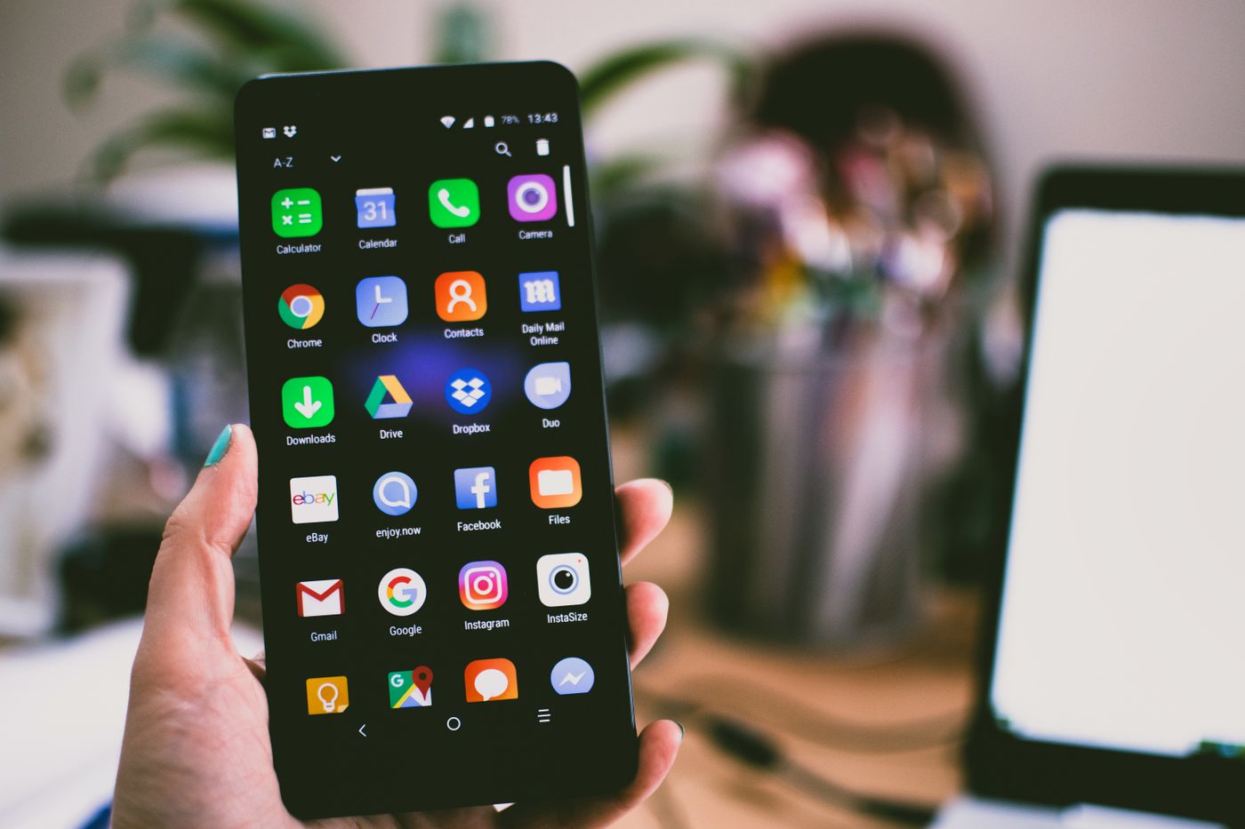
Let us start with the split that most practice owners never see. You spend money on Google Ads, on social, on SEO, all to get people to your website. That traffic arrives. But most of it arrives on a phone, and phones convert worse than the laptop you built the site on. According to 2026 healthcare benchmarks from Digital Applied, medical websites convert mobile visitors at about 2.48 percent, versus roughly 4.11 percent on desktop. Same site, same offer, and the phone visitor is about 40 percent less likely to book.
That gap is not a rounding error. If more than half of your visitors are on a phone, and phone visitors book at nearly half the rate, then most of your marketing budget is landing on the weakest version of your website. The leak is not your ad spend. It is what happens after the tap.
Most patients meet you on a four inch screen
The shift already happened, and it is not close. Well over 60 percent of healthcare related searches now happen on a phone. Think about how you look up a doctor yourself. You are on the couch, or in a parking lot, or lying in bed at 10pm with a symptom you cannot ignore. You are not opening a laptop and sitting down to research. You pull out your phone, search "urgent care near me" or "dermatologist" plus your town, and start tapping.
So the honest way to judge your website is not how it looks on your monitor. It is how it feels in the hand of a stressed person on a phone who has three other options one back button away. That is your real storefront. If it is slow, cramped, or confusing there, none of your other marketing gets a chance to pay off.
Three seconds, and then they are gone
Speed is the first thing that breaks, and it breaks silently. Google's own research, reported by Marketing Dive, found that 53 percent of mobile visitors abandon a page that takes longer than three seconds to load. Half your visitors, gone before they read a word, because a heavy homepage image or a pile of plugins made them wait.
On the office wifi, on a big screen, you never feel this. The site pops right up. On a phone two neighborhoods away, on a weak cell signal, that same page might take eight or ten seconds, and the patient is already back on the search results tapping the next name. You did not lose them to a competitor with better care. You lost them to a spinner. We went deeper on this in our piece on whether website speed affects patient bookings, and the short version is yes, more than almost anything else.
What actually breaks on a phone
Beyond speed, the mobile version of a medical site usually fails in a few predictable places. None of them look like a problem on a desktop, which is exactly why they survive.
- The phone number is not tappable. On a phone, a patient expects to tap your number and have it dial. If it is just text, or an image, you have added a step of copying and pasting that most people will not bother with. A tap to call button at the top is the highest value thing on a healthcare mobile page.
- The booking button is buried. Owners love to open with a welcome paragraph, a mission statement, a stock photo of a stethoscope. On a phone, that pushes the one thing the patient came for way down the screen. The book appointment button should be visible the instant the page loads, before any scrolling.
- The form fights your thumb. A booking form with fifteen fields, tiny tap targets, and dropdowns that jump around is misery on a phone. Every extra field is a reason to quit. Ask for the few things you truly need and collect the rest at the visit. This is the number one reason people bail, which we broke down in why patients abandon your online booking form.
- Too many taps to get anywhere. If booking takes six taps and a pinch to zoom, you have lost most people by tap three. We put a real number on this in how many clicks it should take to book.
- Text and buttons too small to use. If a patient has to zoom in to read your hours or hit a link, the message they get is that you did not think about them. First impressions form in seconds, as we covered in what your website's first impression says.
Each of these is small. Together they are the difference between a patient who books in twenty seconds and one who gives up and calls the practice down the street. And remember, on a phone they will not tell you. They just leave.
The five minute test that shows you the truth
Here is the exercise we run with almost every practice before we touch anything. It costs nothing and it is a little uncomfortable, which is the point.
Pick up your own phone, turn off wifi so you are on cell data like a real patient, and try to book an appointment with your practice from scratch. Start at a Google search, not by typing your web address, because that is how patients actually arrive. Time how long the page takes to appear. Try to tap your number and call. Find the booking button without hunting. Fill out the form with one thumb while standing up. Then, and this is the part that stings, hand the phone to a friend or family member who has never seen the site and just watch. Do not help. See where they pause, squint, or sigh.
Most owners have never once done this. They see their website the way no patient ever will, on a wide monitor with the office internet. The clinic that called us on a Friday afternoon last month swore their site was fine. We asked them to book on their own phone while we stayed on the line. It took them almost four minutes and two tries. They stopped arguing.
Mobile is also how Google decides who to show
There is a second reason this matters, and it happens before a patient ever reaches your site. Google uses mobile first indexing, which means it judges and ranks your site based on the phone version, even for searches done on a computer. A slow, clumsy mobile site does not just convert fewer of the people who arrive. It slowly pushes you down in local search and the map pack, so fewer people arrive at all.
That is why fixing the phone experience pays off twice. You climb higher for the "near me" searches that bring in new patients, and then you convert more of the ones who land. Speed and mobile usability sit right at the intersection of local healthcare SEO and booking. You cannot really separate the two anymore. A site that is a joy to use on a phone is the same site Google wants to show first.
Where EtherealMinds fits in
We are a healthcare only growth agency, and we will be straight with you. A lot of practice websites were built to impress the doctor who signed off on them, not to help a nervous patient book from a phone in a parking lot. Those are two very different jobs. The prettiest homepage in the world is worthless if it takes nine seconds to load and hides the booking button under a paragraph about your philosophy of care.
The websites we build for practices are designed mobile first, on purpose, because that is where your patients are. Fast loads, a tap to call and a booking button right at the top, forms trimmed to what a thumb can finish, and text you never have to zoom to read. And because a great website is only one door, we wire it into the same patient acquisition system that answers the phone, replies to messages, and follows up, so the patient who books at 11pm on their phone actually gets confirmed instead of falling through a crack. The goal is simple: stop losing the patients you already paid to bring to the door.
See where your mobile site leaks patients
Book a free strategy call. We will pull up your website on a phone, time it, try to book like a real patient, and show you exactly where people are dropping off, then fix it inside one patient acquisition system built for healthcare.
Book a free strategy call →