A dermatology group sent us their Facebook ad last spring and asked why it was not working. It was a beautiful ad. Studio lighting, a stock model with flawless skin, the practice logo dead center, and a headline that read "Comprehensive Dermatology Services for the Whole Family." They had spent real money on the design. And it was invisible. Not disliked, not skipped on purpose. Invisible. Patients' eyes slid right over it the way yours slides over a hotel painting.
That is the thing almost nobody tells practice owners about ads. The enemy is not a competitor's ad. The enemy is the scroll. Before a patient decides whether they like your offer, they make a much faster decision, in a fraction of a second, about whether to even slow down. Win that first decision and your message gets a chance. Lose it and your budget funds an ad that technically ran and effectively never existed.
The scroll is faster than you think
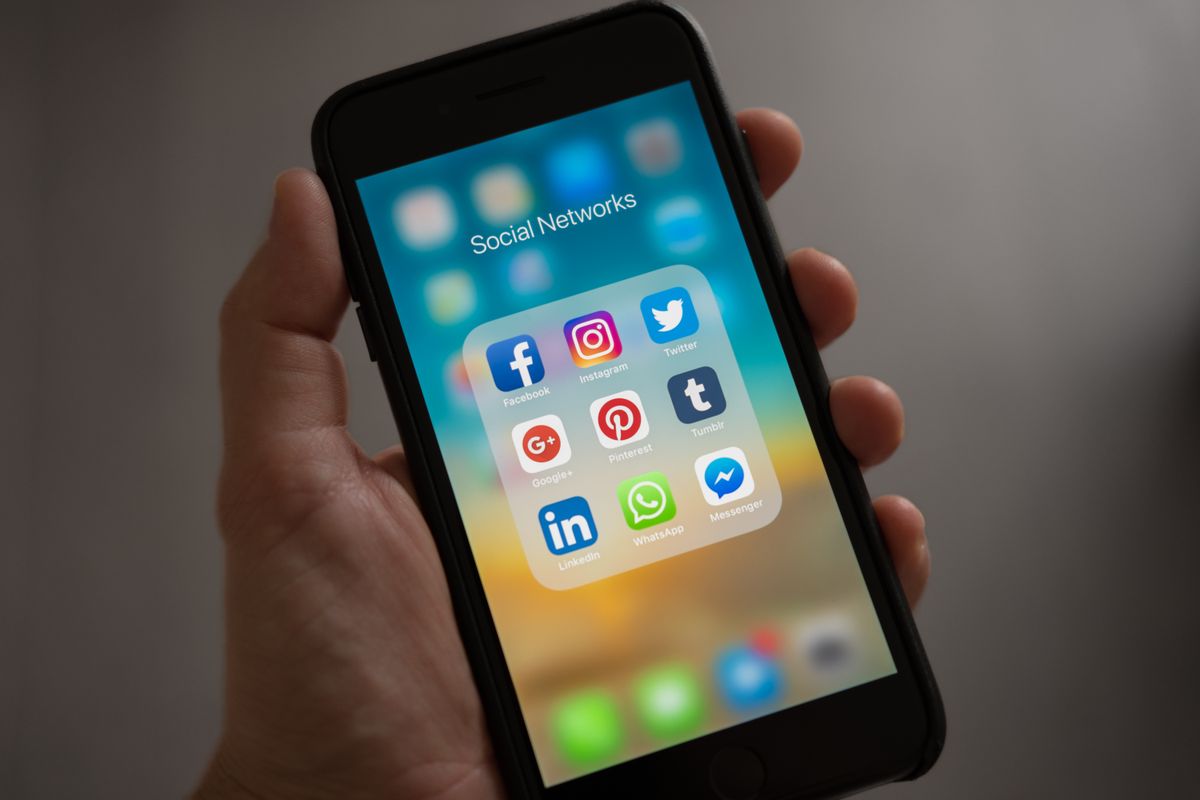
Start with the reality of the environment. Meta has said the vast majority of its users, well over 90 percent, access the apps on mobile, which means your ad shows up on a small screen between a friend's baby photo and a cousin's political rant. People move through that feed fast. Facebook's own research popularized the image of users scrolling the height of the Statue of Liberty in a matter of seconds.
In that setting, Nielsen ran a study for Facebook that should be taped to every practice owner's monitor: across the campaigns they measured, as much as 47 percent of a campaign's value was delivered in the first three seconds, and about 74 percent within the first ten. Read that again. Half the payoff of your ad is decided before most practices have finished showing their logo animation. If your first three seconds are a swoosh, a name, and a tagline, you spent half your money on the least important part.
This is why the dermatology ad failed. Everything good about it, the offer, the credibility, the services, lived in the middle and end. The beginning, the only part that reliably gets seen, was a logo and a corporate headline. Great ad, buried lead.
What actually stops the thumb
A scroll stopper is not a trick. It is relevance that lands instantly. Four things do most of the work in healthcare, and none of them require a big production budget.
- A real human face, looking at the camera. We are wired to stop for faces, especially ones making eye contact. A real doctor or a real patient beats a polished stock model every time, because patients can feel the difference between a person and a prop. The stock photo is a signal that says "ad." A real face says "someone in my town."
- A specific problem, said out loud. "Comprehensive dermatology services" stops no one. "That spot on your back that keeps changing" stops the exact person who has been ignoring a spot on their back. Speak to one real worry, not a menu.
- Motion or a pattern break in the first frame. A face that starts talking, a quick hand gesture, text that appears on screen. Something that is already happening when the ad loads, not a title card that has to finish before the good part starts.
- Words on the screen. A large share of feed video is watched with the sound off. If your hook only works with audio, most people get a silent, confusing clip. Caption the first line so the message lands even on mute.
Notice what is not on that list: your logo, your years in business, your full service list. Those are not bad, they are just not first. They earn their place after you have bought the attention, not before.
The one second test
Before you run any ad, freeze it on the very first frame and cover everything but that image. Ask a friend who knows nothing about your practice: "Would this make you stop scrolling, and can you tell what it is about?" If the honest answer is "it's a logo" or "a nice photo, not sure of what," you have a middle and an end but no beginning. Fix the first second before you spend a dollar on reach.
The Meta rule that keeps killing healthcare ads
Here is where healthcare advertising is genuinely different from selling shoes, and where a well meaning ad turns into a rejected one. Meta's advertising standards prohibit ads that assert or imply knowledge of a person's personal characteristics, and that explicitly includes medical or health conditions. It sounds abstract until you see it in your own copy.
The word that gets practices in trouble is "you." Copy like "Struggling with your acne?" or "Because you have hair loss" or "Living with diabetes?" implies you know something private about the person seeing the ad. That crosses the line, and it is one of the most common reasons healthcare ads get disapproved. The frustrating part is that the exact phrasing that feels most empathetic is the phrasing most likely to be blocked.
The fix is small and it keeps the empathy. Describe the situation in the world instead of pointing at the reader:
- "Struggling with acne?" becomes "Clearer skin is possible, here is how."
- "Because you have hair loss" becomes "Real hair restoration options, explained by a doctor."
- "Living with diabetes?" becomes "A simpler way to manage type 2 diabetes."
Same message, same warmth, no assumption about who is reading. If your practice runs ads and does not know this rule, you are almost certainly getting silent rejections and paying for it in stalled campaigns. It is one of the first things we audit when a clinic hands us their ad account, and it is a big reason we wrote separately about why Facebook rejects medical practice ads.
Before and after photos, and the rules nobody reads
The other classic healthcare ad, especially for med spas, weight loss, and aesthetics, is the before and after split screen. It is also one of the fastest ways to get rejected. Meta restricts direct before and after images, close ups that zoom in on a body part, and creative that implies an unrealistic or guaranteed result. Google runs its own healthcare and personalized advertising policies on top of that, so an ad that clears one platform can still be blocked on the other.
This does not mean you cannot show results. It means you show them differently. A single confident portrait of a real patient who agreed to be featured, a short testimonial in their own words about how they felt, a look at the calm experience of the visit itself, these often build more trust than a clinical grid anyway. Prospective patients are not just buying an outcome. They are buying the feeling of being in good hands. Show that.
One offer, one action, one clear next step
After the hook, the most common mistake is the pile up. The dermatology ad tried to sell acne, skin cancer screening, cosmetic injectables, and pediatric derm in one breath. When an ad speaks to everyone, it moves no one, because no single reader feels "that is about me." A good ad picks one service, one type of patient, and one problem, and lets the other ninety percent of your practice live on your website.
Then it asks for one thing. Not "learn more, and follow us, and visit our site, and call." One action. For most practices that is "book a free consultation" or "check availability." The call to action should be as specific as the promise. And critically, wherever that button goes has to match the ad. If the ad promises a simple way to book a skin check and the click dumps someone on a generic homepage, you break the promise at the worst possible moment and lose the patient you already paid to attract. The ad, the landing page, and the booking step have to tell one continuous story, something we build into every website that converts and every campaign we run.
Video or image, studio or phone
Owners ask which format wins. For a local practice, a short vertical video of the actual provider usually pulls ahead, because it does the two hardest things at once: it stops the scroll with a real face and it builds trust in a field where trust is the whole sale. A fifteen to thirty second clip of your doctor answering a question patients genuinely ask, filmed on a decent phone in good light, routinely beats an expensive studio spot. The phone video feels human. The studio spot feels like an ad, and we are back to being scrolled past.
Static images still earn their keep, especially for a single crisp offer paired with a strong first line of text. The format matters less than the discipline. Real over polished, one idea over ten, first three seconds over everything. That holds whether you are on Meta or running Google Ads for your practice, where the "creative" is your headline and the same rule applies: say the specific thing the searcher is worried about, not your service catalog.
Our honest take
Most practice ads are not bad because the design is ugly. They are bad because they are built in the wrong order. They lead with the logo, hide the hook, talk to everyone, and forget that a patient decides in a heartbeat whether to slow down at all. Flip the order. Open on a real face and a real problem, earn the three seconds Nielsen says are worth half the campaign, make one promise, ask for one action, and send the click somewhere that keeps the promise.
You do not need a bigger budget to do this. You need a better first second. The clinics that outperform their competitors are usually the ones that stopped funding pretty, invisible ads and started funding ads a distracted human actually notices. In a feed designed to keep people moving, being worth stopping for is the entire game.
How EtherealMinds builds ads patients actually stop for
This is the core of what we do. Our patient acquisition system is built around ads that respect the scroll: real faces from your own practice, hooks that name the exact problem your ideal patient feels, copy written to clear Meta and Google's healthcare rules on the first try, and one clear offer that leads to a booking step, not a dead end. We test the first three seconds relentlessly, because that is where the money is decided.
And because a great ad is wasted if the phone rings and nobody answers, we connect every campaign to the rest of the funnel, a fast landing page, honest reviews, and our AI receptionist that catches the calls your ads send after hours. The ad stops the scroll. The system turns that attention into a booked patient.
Get ads worth stopping for
Book a free strategy call. We will look at the ads you are running now, flag the hooks and health rules costing you patients, and show you what a scroll stopping ad for your practice would actually look like.
Book a free strategy call →