Let us be honest about how this question usually comes up. An owner pays for a website, it goes live, it looks clean, and then the new patients do not show up. The site is not broken. It is just missing the handful of things that actually move someone from curious to booked. A site can look great and convert almost no one.
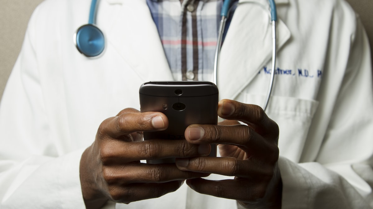
And the stakes are higher than most owners think, because patients judge you by the site before they ever meet you. Research often cited in web design circles, including a 2025 roundup from PC Tech Magazine, found that around 75 percent of people judge a business by its website, and most leave within seconds if it does not give them clarity. For a doctor, that snap judgment is about trust with their health. So the website is not decoration. It is the audition.
Here are the ten things a medical practice website needs to include, in roughly the order that matters.
1. A way to book that is impossible to miss
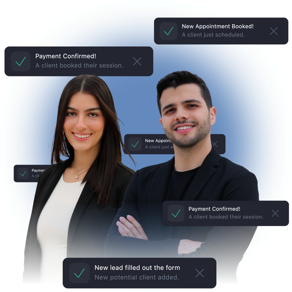
This is the whole point of the site, so put it first and put it everywhere. About 80 percent of patients prefer to choose a doctor who offers online scheduling, and 89 percent want to be able to book anytime online or on mobile, according to scheduling data compiled by LLCBuddy. A bright, obvious booking button belongs at the top of every page, not buried on a contact page three clicks deep.
One detail people get wrong: a form that just emails your front desk to "request" a time is not real online booking. It still makes the patient wait. Real time availability, where they pick an open slot and get a confirmation, is what turns a visitor into an appointment. We made the full case in why patients should be able to book online.
2. A fast, mobile first design
You can have the best content in town, but if it loads slowly on a phone, nobody reads it. About 60 percent of healthcare related searches now happen on a mobile device, per the same scheduling research, and most after hours bookings come from someone on the couch with their phone. If the layout is awkward to tap, the number does not dial, or the page takes five seconds to appear, you lose the majority of your visitors before they see a single service.
Speed is not a luxury feature, it is the floor. We dug into why this slowly drains patients in is your website too slow, and the fix is usually less dramatic than owners fear.
3. One page for each service you offer
This is the SEO move most practices miss. Patients do not search for "dentist." They search for "Invisalign near me," "emergency root canal," or "botox cost." If all your treatments live on one crowded services page, Google has nothing specific to match those searches to, and the patient has to dig.
Give each main service its own page, written in plain language, answering the real questions people ask about it. That is how strangers find the exact thing they came for, and it is a big part of why some practices show up on Google and others do not. We covered that side in why your practice is not showing up on Google.
4. Real reviews, right on the page
Patients trust other patients more than they trust your copy. Roughly 73 percent rely on reviews before booking, and about 70 percent expect to see a 4 star rating or higher before they will even consider a practice, according to patient research summarized by Sprypt. If a visitor has to leave your site to go check you on Google, some of them just keep scrolling on Google and never come back.
Pull a few of your best real reviews onto the homepage and service pages, and link out to your Google Business Profile so people can see the full picture. If reviews are a weak spot, start here: how to get more Google reviews.
5. Real photos of your real practice
Patients can spot a stock photo instantly, and a fake smiling model does the opposite of building trust. One real picture of your actual front door, your waiting room, and the team they will actually meet beats ten polished shots from a stock library. People book with people they can picture meeting.
For the human touch, the same goes for the faces behind the practice. Visitors relax when they can see who is going to take care of them.
6. Provider bios that sound like humans
Before a first visit, patients Google the doctor by name. If all that comes up is a directory listing, they get a little nervous. A short, warm bio with a real photo and a few honest sentences about who you are and why you do this work does a lot of heavy lifting. It is the difference between a name and a person they feel they have already met.
Skip the wall of credentials written like a medical journal. Most patients read at about an eighth grade level, and even slower when they are worried. Write the way you would talk to someone across the desk.
7. Location, hours, and tap to call
This sounds obvious, and it is the thing most often half done. Your address, a map, your real current hours, and a phone number that actually dials when tapped on a phone. Test it yourself right now: open your site on your phone and tap your own number. If you have to copy and paste it, you are losing patients in a hurry, often in pain, who will not bother.
Keep the hours accurate, including holidays. Wrong hours send a patient to your door at the wrong time once, and they do not come back twice.
8. Insurance and payment information
"Do you take my insurance?" is one of the first things most patients want to know, and if the answer is not on the site, many will not call to ask, they will just move on. List the plans you accept on a simple page. If you are a cash pay or membership practice, say so clearly and add one line about financing if you offer it. People say yes to a payment plan they can picture, and freeze at a big number with no context.
Being upfront here also filters out mismatched calls, so your front desk spends time on patients you can actually help.
9. A clear new patient section
First visits come with friction: forms, what to bring, where to park, what to expect. A simple new patient page that answers those questions, and lets people fill out forms before they arrive, lowers no shows and starts visits on time. Texting the forms the night before beats a clipboard of six pages handed to a nervous person who just walked in.
Small things like one line on where to park and which entrance to use turn an anxious arrival into a smooth one.
10. The SEO basics so people find you at all
A perfect website nobody can find is a billboard in the desert. The site needs clean titles, descriptions, local signals like your city and service area, fast load times, and that one page per service so search engines and the new AI search tools can understand and recommend you. More and more patients ask Google's AI answers and even ChatGPT "who is a good dermatologist near me," and those tools read your site to decide who to name. We broke that down in SEO and AI search for healthcare in 2026.
A quick checklist before you call your site done
Open your homepage on your phone and ask: Can I book in one tap? Can I tell what you treat in five seconds? Do I see real reviews and real faces? Can I find your hours, location, and a number that dials? Do I know if you take my insurance? If any answer is no, that is a patient walking out the door, every single day.
The leak even a perfect website does not catch
Here is the honest part. A great website captures the patient who is happy to do it all themselves. But plenty of people still want to talk to a human, especially for a first visit or an urgent question. They tap your shiny new tap to call button, reach voicemail, and you lose them the same way a slow site loses the 9pm visitor. The missed call is the oldest leak in healthcare, and it never shows up in any website report.
That is why we pair a converting website with our AI receptionist. It answers every call and text instantly, day or night, books new patients, and handles the routine questions that used to go to voicemail. Between an easy booking flow for the self service crowd and an always on receptionist for everyone else, the patients you worked hard to attract actually make it onto your calendar.
How EtherealMinds builds this
We build websites for healthcare practices across the United States, and only healthcare. That means we start with conversion, not decoration: real time booking front and center, one page per service for SEO, real photos and reviews for trust, fast mobile first load times, and the new patient and insurance details that answer questions before they become lost calls. Then we wire it into your patient acquisition so the traffic you pay for does not leak at the finish line.
If you want to see what that looks like for your niche, our websites that convert are built around exactly this checklist. A website is the one team member that works every night and never calls in sick. It is worth making sure it actually includes the things that get you booked.
Get a website that books patients while you sleep
Book a free strategy call. We will look at your current site, show you exactly where it leaks patients, and map out a fast, conversion first website built around online booking, real reviews, and an AI receptionist so no call ever goes to voicemail.
Book a free strategy call →