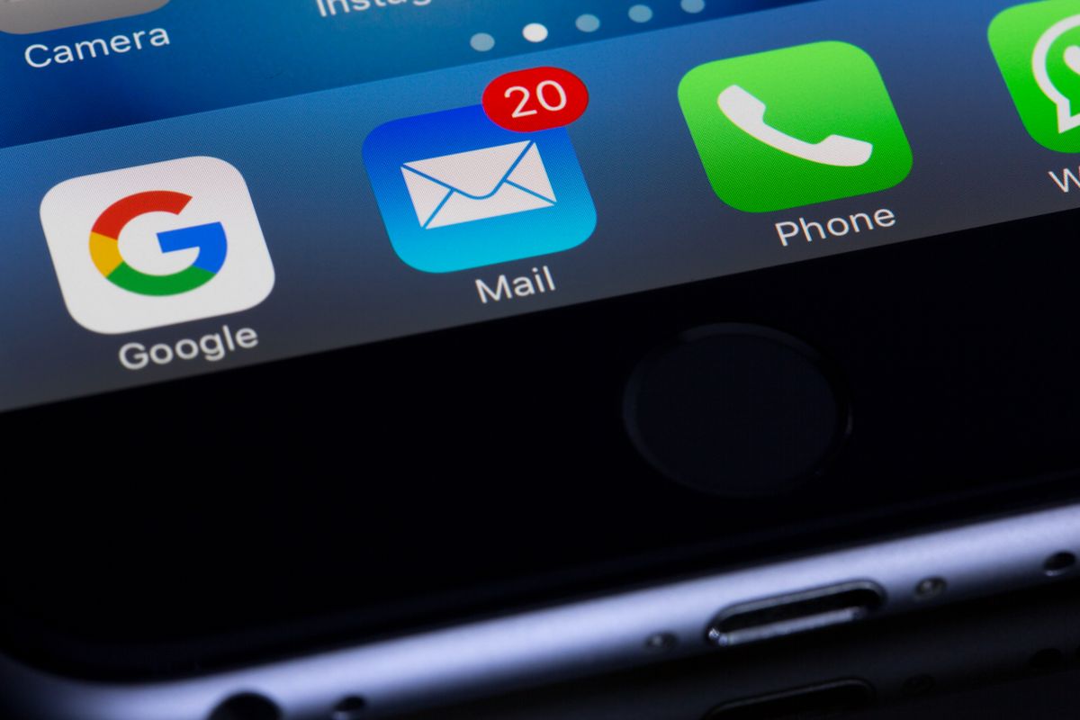
A family practice we worked with had a clean website, decent Google ranking, and a phone that stayed strangely quiet. When we pulled up their site on a phone, the problem took about four seconds to spot. The office number sat in small gray text at the bottom of the homepage, not tappable. To call, a patient had to read it, remember it, switch to the dialer, and type it in. On a small screen, holding a squirming toddler, most people do not bother. They tap back to Google and call whoever is easiest. The practice was not losing patients to a better competitor. It was losing them to a missing button.
So, does a click to call button help a medical practice? Yes, and more than most owners expect, because it sits on top of two facts about how patients actually behave. Let us walk through them, because once you see the numbers, hiding your phone number starts to look like leaving the front door locked during business hours.
Most patients are on a phone, and most still want to call
Start with where people search. The majority of patients look you up online before they ever book, and most of that looking happens on a phone. According to healthcare marketing data compiled by Invoca, around 77% of patients search online before scheduling, and in most healthcare verticals more than 60% run a search first. That search almost always happens on the device in their pocket.
Now the part that surprises people. Even in 2026, healthcare has not moved to self service the way retail has. Invoca's data puts phone bookings at roughly 88% of all healthcare appointments, while only about 2.4% are booked online through a form. Health is personal and private. When someone is worried about a symptom, checking whether you take their insurance, or trying to get a sick kid seen today, they want a human voice, not a form field. Another figure from the same research: patients are about 52% more likely to place a call after a Google search than to convert any other way.
Put those two facts together. Your visitor is on a phone, and the action they most want to take is call you. A click to call button is simply the shortest possible path between those two things. It is not a gimmick. It is the on ramp for the way most patients already prefer to book.
What is a click to call button, exactly
Nothing fancy. It is your phone number turned into a tappable link, so that one tap on a phone opens the dialer with your number already filled in. No memorizing, no copy and paste, no switching apps. On a well built site that button shows up in a few key spots: the top corner of the header, a sticky bar that stays visible as the patient scrolls, the contact page, the footer, and right next to any "book now" prompt.
The opposite, and still shockingly common on older practice websites, is a phone number typed as plain text. It looks the same to you on a desktop. But on a phone it is dead. Tapping it does nothing. That tiny difference, a real button versus flat text, is the whole ballgame, because it decides whether a ready patient reaches you in one motion or gives up halfway.
Test yours in ten seconds
Pull up your website on your phone right now. Find your number and tap it. Does the dialer open with the number ready to go? If yes, good. If nothing happens, or you have to squint and scroll to even find the number, you have a leak. Every mobile visitor who wanted to call just hit a wall you built by accident.
The number is real: mobile design lifts calls
This is not just theory. The same body of healthcare research found that a mobile friendly website design boosts patient call inquiries by around 32%. Think about what that means. Same traffic, same ad budget, same reputation. The only change is that the site is easy to use and the number is easy to tap, and a third more people pick up the phone. There is no ad campaign that gives you that kind of lift for free.
It compounds with everything else you are already paying for. If you run patient acquisition through Google or Meta, you are buying clicks to your site. Every one of those clicks that lands on a page where the number is hard to tap is money you spent to send someone to a locked door. A click to call button is how you stop paying for traffic that cannot convert. We dug into a related leak in what percentage of callers actually book an appointment, and the pattern is the same: the practices that win are the ones that make each step effortless.
Speed matters as much as the button
A button only helps if the patient sticks around long enough to tap it. On mobile, a slow page is a silent killer. If your site takes five seconds to load on a phone, a big chunk of visitors leave before they ever see your number, button or not. We covered this in depth in how website speed affects patient bookings, and the short version is that every extra second of load time bleeds off patients who were ready to call.
The same goes for the basics of a mobile layout: text you can read without pinching, tap targets big enough for a thumb, no pop up covering the number. If you have never checked how your site behaves on a phone, start with our rundown on whether your medical practice website is mobile friendly. The button is the finish line, but the whole mobile experience is the track that leads to it.
A button is useless if nobody answers
Here is the honest catch, and it is the one most practices trip on. A click to call button that rings out to voicemail is worse than no button, because it delivers the patient to a dead end faster and with more hope. You made it effortless to call, and then the call went nowhere. Now they feel doubly ignored, and they are dialing your competitor before they have even hung up.
The stakes are not small. We broke down the math in how much a missed call costs a medical practice, and a single new patient is often worth hundreds to thousands of dollars over their lifetime with you. Every missed call is that number, walking out the door. So the button and the answer have to be solved as one problem. That means covering the times calls actually leak: the lunch hour, evenings, weekends, and the moment when the front desk is already on two other lines.
The button and the answer are one system
A click to call button raises the number of people who call. That is only a win if those calls get answered. Pair the button with a real plan for the busy hour and the after hours window, or you have just built a faster path to your voicemail. Capture, then answer. Both, or neither.
The realistic fixes are a mix. Stagger the front desk lunch so a live line stays open at noon. Have an after hours plan instead of a machine. And for the overflow, the calls that come in while your team is genuinely swamped, this is exactly where our AI receptionist earns its keep: it answers on the first ring, checks insurance, books the appointment, and never sends a ready patient to voicemail. We laid out the wider picture in voice AI for medical practice phones, and the theme is consistent. The button gets them to call. Something has to be there to pick up.
Should you push online booking instead?
Some owners hear all this and think the answer is to skip the phone and force everyone into online booking. That is a mistake in healthcare. Online booking is great, and you should absolutely offer it for the patient who wants to self schedule at 9pm without talking to anyone. But it serves the minority. The 88% who prefer to call are not being difficult. They have a question about insurance, a nervous parent's worry, a complicated history that does not fit neatly into a form's dropdown menus.
So the right answer is both, side by side, and let the patient choose. Speed still matters here too, because slow follow up kills warm leads either way, as we covered in how fast you should respond to a new patient lead. A form that sits unanswered for six hours loses the patient just like a phone that rings out. Give people the call button and the booking button, answer both fast, and you stop forcing a personal decision into a channel the patient did not want.
How EtherealMinds sets this up
When we build or rebuild a practice site, the click to call button is not an afterthought we tack on. It is baked into the layout: number in the header, a sticky call bar on mobile, and a clear call option next to every booking prompt, all of it tappable, all of it fast loading. This is standard on the websites we build for healthcare practices, because a beautiful site that hides the phone number is a beautiful way to lose patients.
But we do not stop at the button, because we have seen too many practices install one and still lose calls to voicemail. We connect it to a way to actually answer, so the calls the button generates get picked up during lunch, after hours, and on the busiest afternoons. That full loop, get found, make it effortless to call, then answer every time, is what our patient acquisition system runs as one machine. A button on its own is a nice detail. A button wired to a phone that always gets answered is a growth engine.
The honest bottom line
Does a click to call button help a medical practice? Yes, clearly, and it is one of the cheapest wins available to you. Most patients search on a phone, most still book by voice, and a mobile friendly site with a tappable number pulls in about a third more calls. The button costs you almost nothing and captures demand you already paid to earn. The only way it fails is if the calls it creates ring out to nobody. Fix both at once, the button and the answer, and you turn the quietest phone in the building into a booked schedule.
Turn phone traffic into booked patients
Book a free strategy call. We will pull up your website on a phone, show you exactly where patients are dropping off, and map out a click to call setup wired to a phone that always gets answered, front desk hours, after hours, and the busy lunch rush included. Healthcare only, no fluff.
Book a free strategy call →